I’m a landscape artist but what I love about painting buildings and streets is that those were all built by people and lived in by people and used by people. My art tries to use the physical cityscape to represent and celebrate the people who spend their lives in those spaces and give them meaning.

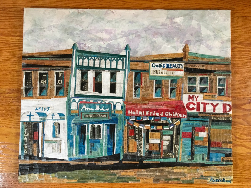
I call this painting “Halal fried chicken” and it gives me so much joy. Through many visits to family in Jamaica, New York over the years I have come to love the messy and complex energy of Queens. And it feels down to earth and it feels…real?
This little grouping with a church, two restaurants, a corner store, and a salon is the perfect example of what I love about Queens. I snapped a photo of it years ago and it’s been stuck in my head like a visual refrain for a long time, long before I ever thought of painting it. Here’s the photo I took in 2017:
And visually, it’s something completely different from my Somerville, Cambridge, or Boston landscapes. Building and neighborhoods here tend to be more monochromatic. In Queens, every shop, place of worship, dentist’s office, or restaurant has a huge, colorful awning out in front on the sidewalk telling the world what it is.

When I set out to do this painting, I knew that featuring the awnings and the lettering was going to be the major focal point of the piece, which meant a whole new approach for me. Trying to recreate fonts in paper is interesting, to say the least! Also, I rarely use true to life colors and instead kind of create a palette that works for me. But the signs and the colors are my favorite parts of this piece. It’s also less representational than most of my landscapes, at least of the ones that are of real places. I tried a stylized approach, playing up funky lines and edges and trying to de-emphasize the right angled grid that is so easy to get from a row of buildings with windows and doors. But I did try hard to match true colors for the most part.
I did simplify the names and signs; the Greek Orthodox church on the left had a much longer name, but I only had room for the word “Saint” in Greek. The spelling of “Halal Fried Chiken” is just like that on the real store front. The “My City” sign is actually “My city deli” but leaving off most of the “deli” felt right.

I don’t think it’s perfect; I’m constantly wondering if I should have abstracted it further or gone with realistic perspective and proportions. Also trying to match real life colors when they are a series of signs and advertisements rather than colors occurring in nature came out a little weird and off to me? Color balance is something that I usually feel like I do pretty well but this didn’t feel quite right to me in terms of the color relationships.

But nonetheless I’m really proud of this piece because it was a totally new style for me and I learned a lot through doing it. It genuinely and respectfully celebrates a place that I hold dear. I think what I love most about it is the energy and sense of momentum that I got while working on it. I couldn’t stop thinking about it and any time I was away from my studio I couldn’t wait to get back. It gave me this sense of hope and purpose which was really exciting.
